Brush Lettering Process + Freebie

Ever wonder how letterers compose their designs? Some lettering artists appear to have a knack for composing their words and letters right on the page. My process is totally not like that. If I knew that I was trying to compose a lettering piece right there on that page, I’d clam up and probably never get started.
I’m going to share a special sneak into my process.
Jot down the phrase I want to letter

Get warmed up
Most times I will start with a simple alphabet to get the brush arm going. I use scrap paper for this so I don’t get hung up on wasting supplies.


One word per page
I letter each word separately and multiple times. Some could argue that it’s the art equivalent of “spray-and-pray” but it keeps me from locking up from perfectionism. When I know that I have another chance to write out a word, I end up performing a lot better. It’s all part of knowing myself!


Let my papers dry
Luckily I have a spare bedroom where I can spread out the papers on the floor and they won’t be disturbed.

Scanning
I use a ScanSnap iX500to scan as 600dpi in grayscale. This is the highest possible resolution of my scanner so that print quality will ultimately be fabulous. After scanning, the painted originals go in the recycling.


Turning each word into transparent PNG files
This part is quite lengthly, and consists of the following steps:
Select the best version of each word and crop it away from the rejects.

Adjust the blackness of the text using levels.

Create transparency around and within the lettering.

Clean up any digital noise that came in through the scan.

Adjust any wobbly edges in the letters.

Save the file as a PNG.
Putting the words together
I start by opening an 8×10 file since I’m aiming for that to be my final print size. I bring in all my PNG files and resize to fit.
Here’s where I’ll rearrange and decide where I want my words to be.

Options:

I use guides to help me stay centered and when I like my design, I’ll merge all my word layers.

Adding color
If I liked the black text, I could leave it there, but I love color! I add a new solid color layer using the layers menu and check the option for a clipping mask.

Saving as a JPEG
And that’s how I get to my final piece!
The process I use has a lot of steps to it, but I find it useful for being able to easily manipulate the composition of a lettering piece. It can give me a lot of flexibility for creating multiple orientations of the same sets of words.
And for sticking around til the end, you can download this print for free! Just pop your email address in the box below, and the download link will appear afterwards.
[et_bloom_locked optin_id=”optin_4″]
Download here! Includes 8×10 jpeg file.
[/et_bloom_locked]
If you liked this post, please share with your friends!
Presents for You: Brush Lettered Chanel Quote

I love quotes. And I love to letter them out. And I’m happy to be able to share with you!
Use for Project Life, scrapbook, art journals, or just print it out and hang on your walls. Just click the links below to download the version you desire.
Click on photos for JPG
8×10 inch Color PDF
8×10 inch Charcoal PDF
Transparent PNG

I’d love to see what you’re doing with my lettering and you can share your great ideas with others too! Tag me on instagram @randomolive and use the hashtag #randomoliveletters.
Personal use only. (Because these words are neither yours or mine to sell.)
Do you have a favorite quote you’d like to see lettered? Suggest it in the comments!
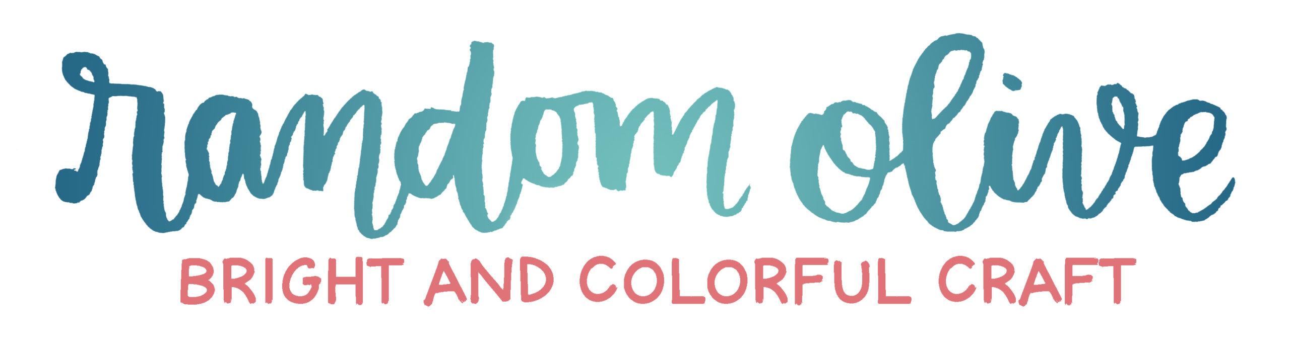
Before and After: RandomOlive Header Design

I hope you’ve noticed that I’ve freshened up the site design with a new mobile-responsive theme and a new header design and site tagline.
Why the change?
When I started the blog last summer, I wanted to stick with a font-based design as a start. I picked Intro as my bold slab serif font and Bellota as a script font. I combined them together as a starter logo for my site. I still plan to use these fonts throughout my site and as headers on photos throughout the blog. I created the tagline “the random brightness of everyday life” mostly because I didn’t know exactly what the blog was going to be about. The only plan I had was that my posts would start off random as my interests flowed, and I’d figure it out as I gained more experience.
What’s different now?
My brush lettering has improved tons since last summer, so I felt a lot more confident using my own hand-drawn design as my header. I changed the tagline to “injecting brightness, color, and fun into your everyday”. It’s similar to the old tagline with the idea of incorporating brightness into your everyday, but this time, I started with the word “injecting”. This is important! I want to take an active role, and by using this verb in my tagline, I’m showing you that I’m doing my job to help you (the reader).
What’s the same?
The color scheme throughout the blog is the same. Navy, coral, teal. If you knew me in real life, you’d know these are my wardrobe staples. So of course, they’d be my website colors!
I hope you enjoyed reading about the thought process behind my design changes! Have you changed anything up on your sites lately?
Better Than Before: Book Review

Another awesome book by Gretchen Rubin: Better Than Before: Mastering the Habits of Our Everyday Lives is a book about building and sticking to habits. Rubin writes from the perspective that all these habits ultimately inform our happiness if we select the right ones.
How this Book is Organized
Rubin starts with the idea that the ease at which we develop habits depends on our personal tendencies. Rubin proposes that people generally fall into four tendencies: Upholder, Questioner, Obliger, or Rebel. (Find out which one you are here)
Next up, is information about the qualities of habit building, how to start, the stuff that gets in the way of making habits stick, and dealing with the people around you.
Overall Impression
As a fan of both habit resources (see my post rounding up habit resources) and Gretchen Rubin (see my review of The Happiness Project), I expected to really enjoy this book. It didn’t disappoint. I realized that I was truly a Questioner and it’s really difficult for me to build habits that I don’t totally buy into. Knowing this about myself will help me to develop strategies for building new habits.
Useful For
This book is useful for those of you who are looking for a new approach to habit-building. If you’ve had a hard time sticking to habits before, even with all the rules and advice out there, this book will offer you some perspective for adapting to your own personality type.
Amazon links are affiliate.
Pinboard: Digital Graphics
I’m always keeping an eye out for graphics that I can use for all my digital art projects. I can incorporate graphics into the digital prints that I sell, into my art journals, or my project life pages. I collect the graphics that appeal to me on my Pinterest page (where else?) so I can scroll through easily when I want to stock up on more supplies. Take a look around and see if any of them appeal to you too!
Follow Olivia (Random Olive)’s board design: lovely graphics on Pinterest.
Presents for You: Brush Lettered Grey Quote

I love quotes. And I love to letter them out. And I’m happy to be able to share with you!
Use for Project Life, scrapbook, art journals, or just print it out and hang on your walls. Just click the links below to download the version you desire.
Click on photos for JPG
8×10 inch Color PDF
8×10 inch Charcoal PDF
Transparent PNG

I’d love to see what you’re doing with my lettering and you can share your great ideas with others too! Tag me on instagram @randomolive and use the hashtag #randomoliveletters.
Personal use only. (Because these words are neither yours or mine to sell.)
Do you have a favorite quote you’d like to see lettered? Suggest it in the comments!
A Year of Morning Pages

This is the story of how free-writing on a (nearly) daily basis changed my life.
Remember when I told you about how The Happiness Project turned me around for the better? Writing morning pages is the other component of it.
In early 2014, I was in a funk. I could only explain the phenomenon as “blah” and I felt blah-by. Yes, I totally made that word up. I self-diagnosed myself with burnout (after taking a few too many online psychology tests) and looked up resources on how to get out of it.
That’s where the concept of morning pages came in. The idea was developed by artist Julia Cameron and the basic idea is that you free-write whatever is in your stream of consciousness first thing in the morning for three pages. (more info on her website) This process is related to journaling, but also, totally different for me somehow. I had tried journaling on-and-off for years, and I could never keep up. I felt like nothing would live up to the beautiful notebook I tried to use. Or if I had a bad handwriting day, I felt it wasn’t worthy of the pretty notebook.

My approach to morning pages was different. I let myself use the cheapest notebooks in my collection. (Which are the generic notebooks I hoard for ten cents apiece during back-to-school season). I let myself use whatever pens I have lying around (nothing special). And I let myself use the messiest handwriting without any care. Using cheap supplies really helps get over the thought of “wasting” the good stuff.
Letting myself use ugly messy scrawly writing in cheap notebooks helped to clarify so many of the thoughts swirling in my head. I would write about the most mundane things that were on my mind, like if I was hungry, or what I planned to do that day, or what bothered me from the day before. Just the act of writing made me realize that I really am a creative and artistic and crafty person. These pages also are a place where I brainstorm and follow my ideas from one unrelated string to another. So many of my blog posts and project ideas get their start in those morning pages (even this one).
I’ve found that this is a habit that helps to calm me. Some days all I write is inspirational words to myself like: you can do this, keep going, just start, you’re making progress, stick with it. And it helps me to block out the noise of what’s going on out there in the world and really focus on my own motivation and ideas.
Do any of you keep morning pages? Or are you interested in giving it a try? Share in the comments!
Digital Project Life Layouts: June 2014
Project Life is my preferred method of scrapbooking and I’m hoping to provide you with some useful tips for either documenting your own lives or putting together your own pages with minimal fuss.
Here’s what I’m going to emphasize with the layouts I share:
- The random stuff I like to capture and document for myself.
- The simple approach to Project Life that I take. There are a lot of photos and very little embellishment and journaling.
- The way I organize some spreads into themes or stories.
You can click on each image below for a slightly larger view.

Capture Idea: Can you tell we like to go out to eat a lot?
Capture Idea: For eBooks, I take a screenshot of the cover from the Kindle app on my phone. I’m what you’d call the cliche voracious reader, so I like to document the books I read.
Story Idea: The right page is entirely from a trip to Disneyland.
Simplicity Point: I had a filler card of Mickey that I downloaded from Sahlin Studio (available here) and I recolored it to match the journaling card I put on this page.

Capture Idea: Before and after shots. I was working on trimming this plant in my backyard and wanted to show my husband the before and after while he was at work.
Capture Idea: Any digital receipts or invoices of fun stuff? We bought the LEGO Ghostbusters Ecto-1 (affiliate link), which was super fun for my husband.
Capture Idea: Progress shots of your hobbies! Seriously, these are so fun to look back on.
Simplicity Point: The screenshots I take of my book covers end up just slightly smaller than the 3×4 slot. I just fill that background with white and call it a day. You could also use digital scrapbook paper.

Story Idea: San Francisco Trip. Organizing spreads into trips and locations makes so much more sense to me than breaking it up by week, especially since travel dates may overlap different weeks.
Simplicity Point: One journal card on the left for quick recap. And then one filler card to balance.

Capture Idea: While I was in SF, my husband was at home and received his new Lego toy. He sent me progress shots as he was building it. Pretty neat idea though. Can you tell I like to document progress?
Resources:
Photos edited with RadLab. (Affiliate Link)
Templates by Cathy Zielske: 01, 02, 05
Fonts: ABeeZee and Klinic Slab
Kit: Kraft Edition
For more info on my general approach to Project Life, check out this blog post.
Project Life is a memory-keeping system created by Becky Higgins. She’s awesome. Go visit her website for more information or watch her 3-day course on CreativeLive.
Pen Collection: Green

I have an obsession with office supplies and I’m a bit of a pen hoarder. One thing that I enjoy doing is swatching out my writing utensils to see how the colors compare between brands.
The Test: Each pen is used on white notebook paper and a yellow legal pad. You can click on the image below for a larger view.

The Pens: (links are affiliate) Paper Mate InkJoy 100 | Paper Mate InkJoy 300 RT
| Paper Mate Profile Elite
| Pilot B2P Bottle to Pen – Ball Point
| BIC Cristal Bold
| Pentel EnerGel
| Pilot G2
| Pilot G2 1.0
| Pilot Precise V7 RT
| Paper Mate Flair
The Conclusion: Green is another fun color I love to write with when I’m at work. The Papermate Inkjoys are very pale, so I don’t enjoy those as much. The Papermate Profile and Bic Cristal Bold provide lovely dark green shades though. And any of the gel, rollerball, or felt tips are solid.
Presents for You: Brush Lettered Peters Quote

I love quotes. And I love to letter them out. And I’m happy to be able to share with you!
Use for Project Life, scrapbook, art journals, or just print it out and hang on your walls. Just click the links below to download the version you desire.
Click on photos for JPG
8×10 inch Color PDF
8×10 inch Charcoal PDF
Transparent PNG

I’d love to see what you’re doing with my lettering and you can share your great ideas with others too! Tag me on instagram @randomolive and use the hashtag #randomoliveletters.
Personal use only. (Because these words are neither yours or mine to sell.)
Do you have a favorite quote you’d like to see lettered? Suggest it in the comments!

