
I hope you’ve noticed that I’ve freshened up the site design with a new mobile-responsive theme and a new header design and site tagline.
Why the change?
When I started the blog last summer, I wanted to stick with a font-based design as a start. I picked Intro as my bold slab serif font and Bellota as a script font. I combined them together as a starter logo for my site. I still plan to use these fonts throughout my site and as headers on photos throughout the blog. I created the tagline “the random brightness of everyday life” mostly because I didn’t know exactly what the blog was going to be about. The only plan I had was that my posts would start off random as my interests flowed, and I’d figure it out as I gained more experience.
What’s different now?
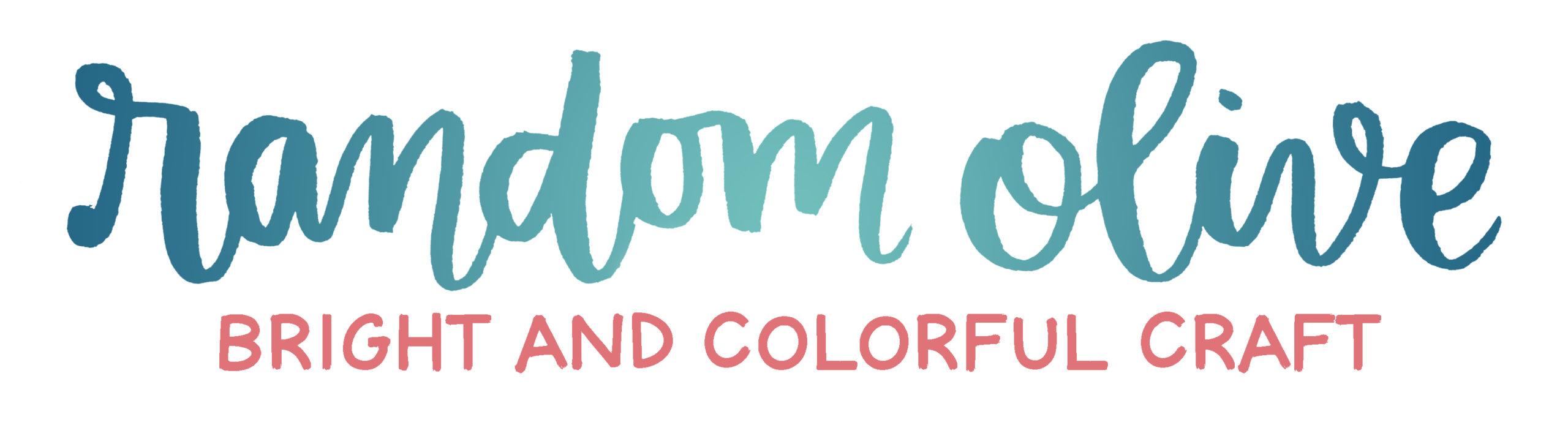
My brush lettering has improved tons since last summer, so I felt a lot more confident using my own hand-drawn design as my header. I changed the tagline to “injecting brightness, color, and fun into your everyday”. It’s similar to the old tagline with the idea of incorporating brightness into your everyday, but this time, I started with the word “injecting”. This is important! I want to take an active role, and by using this verb in my tagline, I’m showing you that I’m doing my job to help you (the reader).
What’s the same?
The color scheme throughout the blog is the same. Navy, coral, teal. If you knew me in real life, you’d know these are my wardrobe staples. So of course, they’d be my website colors!

