Resource Round-Up: Gallery Walls

In-progress shot of my downstairs gallery wall from July 2012
Gallery walls are ubiquitous on Pinterest. Seriously, just search “gallery wall” and you’ll be inundated with resources to help you spruce up your space. But what are the best tutorials out there for actually getting to work and getting it done?
These are the resources that I used when I was putting together my own walls. I’ve got a wall-o-frames in both my upstairs hallway and my downstairs entry. So I have definitely put the advice to good use.
- The tutorial by Young House Love is hands down the most comprehensive tutorial on the web. I swear by nearly everything they say about home decor. While John and Sherry aren’t actively blogging anymore, we should totally take advantage of their archives while they last. Best tip: Start hanging from the center of the arrangement and work your way out, in case you need to adjust anything once the frames get on the wall. We used this tip for our walls, and they turned out great!
- Have you got an awkward corner to work with? A Beautiful Mess has you covered there. Includes a video to show the action!
- More ideas for frame fillers at Two Twenty One. Best tip: Make a wire loop for frames with unfortunately difficult nail hooks.
- Don’t want to mess with paper templates? Well, you could do what Katie Bower does.
Hope that helps weed through some of the unhelpful Pinterest search results! Happy gallery-walling!
Presents for You: Brush Lettered Frost Quote

I love quotes. And I love to letter them out. And I’m happy to be able to share with you!
Use for Project Life, scrapbook, art journals, or just print it out and hang on your walls. Just click the links below to download the version you desire.
Click on photos for JPG
8×10 inch Color PDF
8×10 inch Charcoal PDF
Transparent PNG

I’d love to see what you’re doing with my lettering and you can share your great ideas with others too! Tag me on instagram @randomolive and use the hashtag #randomoliveletters.
Personal use only. (Because these words are neither yours or mine to sell.)
Do you have a favorite quote you’d like to see lettered? Suggest it in the comments!
Skillshare Course Review: The Final Steps of Hand-Lettering

The follow up Skillshare class by Mary Kate McDevitt focuses on the Final Steps of Hand-Lettering (dealing with color and texture).
The course starts after you have a refined sketch of a lettering piece and starts with the inking of the drawing on a lightpad. This is a demonstration by Mary Kate as she talks through how she inks certain aspects of her drawing and whether she traces on different layers of paper.
Main Takeaways:
Digitizing:
Mary Kate goes through the digitizing process in Adobe Illustrator in detail. Lots of steps here!
Textures:
Mary Kate demonstrates how to create hand-drawn textures using a variety of tools (markers, stamps, brushes, etc) and then how to apply them to the lettering digitally. She also demonstrates how to use Photoshop brushes to refine those textures.
Overall Impressions:
The entire course is 3.5 hours. The material is at an advanced skill level for adding details to your sketch and there are lots of specific digital techniques here. If you’re just getting started with hand-lettering, this information may go beyond your zone of focus. This course would be great for people who are already skilled at lettering and wanting to customize the colors and textures using a combination of Adobe Illustrator and Photoshop.
The links provided for this Skillshare course are referral links. If you sign up for a Skillshare membership using these links, I will receive a free month of membership. This will allow me to view and review even more courses on the blog.
Pen Collection: Red
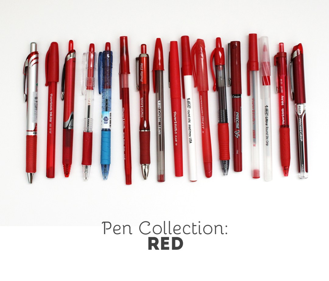
I have an obsession with office supplies and I’m a bit of a pen hoarder. One thing that I enjoy doing is swatching out my writing utensils to see how the colors compare between brands.
The Test: Each pen is used on white notebook paper and a yellow legal pad. You can click on the image below for a larger view.


The Pens: (links are affiliate) Paper Mate InkJoy 100 | Paper Mate InkJoy 300 RT
| Paper Mate Write Bros
| Paper Mate Write Bros Grip
| Papermate Eagle
| Papermate ProFit | Paper Mate Profile Elite
| Bic Round Stic | BIC Round Stic Grip
| BIC Cristal Bold
| Pilot EasyTouch
| Pilot B2P Bottle to Pen – Ball Point
| Pentel EnerGel
| Pilot G2 1.0
| Pilot Precise V7
| Pilot Precise V7 RT
| Pilot Precise Grip Bold
| Paper Mate Flair
The Conclusion: Red is one of the three basic colors, so tons of varieties are available. I don’t often write things out with red… it’s my go to color for crossing things off my lists.
Brush Lettering Process + Freebie

Ever wonder how letterers compose their designs? Some lettering artists appear to have a knack for composing their words and letters right on the page. My process is totally not like that. If I knew that I was trying to compose a lettering piece right there on that page, I’d clam up and probably never get started.
I’m going to share a special sneak into my process.
Jot down the phrase I want to letter

Get warmed up
Most times I will start with a simple alphabet to get the brush arm going. I use scrap paper for this so I don’t get hung up on wasting supplies.


One word per page
I letter each word separately and multiple times. Some could argue that it’s the art equivalent of “spray-and-pray” but it keeps me from locking up from perfectionism. When I know that I have another chance to write out a word, I end up performing a lot better. It’s all part of knowing myself!


Let my papers dry
Luckily I have a spare bedroom where I can spread out the papers on the floor and they won’t be disturbed.

Scanning
I use a ScanSnap iX500to scan as 600dpi in grayscale. This is the highest possible resolution of my scanner so that print quality will ultimately be fabulous. After scanning, the painted originals go in the recycling.


Turning each word into transparent PNG files
This part is quite lengthly, and consists of the following steps:
Select the best version of each word and crop it away from the rejects.

Adjust the blackness of the text using levels.

Create transparency around and within the lettering.

Clean up any digital noise that came in through the scan.

Adjust any wobbly edges in the letters.

Save the file as a PNG.
Putting the words together
I start by opening an 8×10 file since I’m aiming for that to be my final print size. I bring in all my PNG files and resize to fit.
Here’s where I’ll rearrange and decide where I want my words to be.

Options:

I use guides to help me stay centered and when I like my design, I’ll merge all my word layers.

Adding color
If I liked the black text, I could leave it there, but I love color! I add a new solid color layer using the layers menu and check the option for a clipping mask.

Saving as a JPEG
And that’s how I get to my final piece!
The process I use has a lot of steps to it, but I find it useful for being able to easily manipulate the composition of a lettering piece. It can give me a lot of flexibility for creating multiple orientations of the same sets of words.
And for sticking around til the end, you can download this print for free! Just pop your email address in the box below, and the download link will appear afterwards.
If you liked this post, please share with your friends!
Presents for You: Brush Lettered Chanel Quote

I love quotes. And I love to letter them out. And I’m happy to be able to share with you!
Use for Project Life, scrapbook, art journals, or just print it out and hang on your walls. Just click the links below to download the version you desire.
Click on photos for JPG
8×10 inch Color PDF
8×10 inch Charcoal PDF
Transparent PNG

I’d love to see what you’re doing with my lettering and you can share your great ideas with others too! Tag me on instagram @randomolive and use the hashtag #randomoliveletters.
Personal use only. (Because these words are neither yours or mine to sell.)
Do you have a favorite quote you’d like to see lettered? Suggest it in the comments!
Before and After: RandomOlive Header Design

I hope you’ve noticed that I’ve freshened up the site design with a new mobile-responsive theme and a new header design and site tagline.
Why the change?
When I started the blog last summer, I wanted to stick with a font-based design as a start. I picked Intro as my bold slab serif font and Bellota as a script font. I combined them together as a starter logo for my site. I still plan to use these fonts throughout my site and as headers on photos throughout the blog. I created the tagline “the random brightness of everyday life” mostly because I didn’t know exactly what the blog was going to be about. The only plan I had was that my posts would start off random as my interests flowed, and I’d figure it out as I gained more experience.
What’s different now?
My brush lettering has improved tons since last summer, so I felt a lot more confident using my own hand-drawn design as my header. I changed the tagline to “injecting brightness, color, and fun into your everyday”. It’s similar to the old tagline with the idea of incorporating brightness into your everyday, but this time, I started with the word “injecting”. This is important! I want to take an active role, and by using this verb in my tagline, I’m showing you that I’m doing my job to help you (the reader).
What’s the same?
The color scheme throughout the blog is the same. Navy, coral, teal. If you knew me in real life, you’d know these are my wardrobe staples. So of course, they’d be my website colors!
I hope you enjoyed reading about the thought process behind my design changes! Have you changed anything up on your sites lately?
Better Than Before: Book Review

Another awesome book by Gretchen Rubin: Better Than Before: Mastering the Habits of Our Everyday Lives is a book about building and sticking to habits. Rubin writes from the perspective that all these habits ultimately inform our happiness if we select the right ones.
How this Book is Organized
Rubin starts with the idea that the ease at which we develop habits depends on our personal tendencies. Rubin proposes that people generally fall into four tendencies: Upholder, Questioner, Obliger, or Rebel. (Find out which one you are here)
Next up, is information about the qualities of habit building, how to start, the stuff that gets in the way of making habits stick, and dealing with the people around you.
Overall Impression
As a fan of both habit resources (see my post rounding up habit resources) and Gretchen Rubin (see my review of The Happiness Project), I expected to really enjoy this book. It didn’t disappoint. I realized that I was truly a Questioner and it’s really difficult for me to build habits that I don’t totally buy into. Knowing this about myself will help me to develop strategies for building new habits.
Useful For
This book is useful for those of you who are looking for a new approach to habit-building. If you’ve had a hard time sticking to habits before, even with all the rules and advice out there, this book will offer you some perspective for adapting to your own personality type.
Amazon links are affiliate.
Pinboard: Digital Graphics
I’m always keeping an eye out for graphics that I can use for all my digital art projects. I can incorporate graphics into the digital prints that I sell, into my art journals, or my project life pages. I collect the graphics that appeal to me on my Pinterest page (where else?) so I can scroll through easily when I want to stock up on more supplies. Take a look around and see if any of them appeal to you too!
Follow Olivia (Random Olive)’s board design: lovely graphics on Pinterest.
Presents for You: Brush Lettered Grey Quote

I love quotes. And I love to letter them out. And I’m happy to be able to share with you!
Use for Project Life, scrapbook, art journals, or just print it out and hang on your walls. Just click the links below to download the version you desire.
Click on photos for JPG
8×10 inch Color PDF
8×10 inch Charcoal PDF
Transparent PNG

I’d love to see what you’re doing with my lettering and you can share your great ideas with others too! Tag me on instagram @randomolive and use the hashtag #randomoliveletters.
Personal use only. (Because these words are neither yours or mine to sell.)
Do you have a favorite quote you’d like to see lettered? Suggest it in the comments!

