Resource Round-Up: Gallery Walls

In-progress shot of my downstairs gallery wall from July 2012
Gallery walls are ubiquitous on Pinterest. Seriously, just search “gallery wall” and you’ll be inundated with resources to help you spruce up your space. But what are the best tutorials out there for actually getting to work and getting it done?
These are the resources that I used when I was putting together my own walls. I’ve got a wall-o-frames in both my upstairs hallway and my downstairs entry. So I have definitely put the advice to good use.
- The tutorial by Young House Love is hands down the most comprehensive tutorial on the web. I swear by nearly everything they say about home decor. While John and Sherry aren’t actively blogging anymore, we should totally take advantage of their archives while they last. Best tip: Start hanging from the center of the arrangement and work your way out, in case you need to adjust anything once the frames get on the wall. We used this tip for our walls, and they turned out great!
- Have you got an awkward corner to work with? A Beautiful Mess has you covered there. Includes a video to show the action!
- More ideas for frame fillers at Two Twenty One. Best tip: Make a wire loop for frames with unfortunately difficult nail hooks.
- Don’t want to mess with paper templates? Well, you could do what Katie Bower does.
Hope that helps weed through some of the unhelpful Pinterest search results! Happy gallery-walling!
Skillshare Course Review: The Final Steps of Hand-Lettering

The follow up Skillshare class by Mary Kate McDevitt focuses on the Final Steps of Hand-Lettering (dealing with color and texture).
The course starts after you have a refined sketch of a lettering piece and starts with the inking of the drawing on a lightpad. This is a demonstration by Mary Kate as she talks through how she inks certain aspects of her drawing and whether she traces on different layers of paper.
Main Takeaways:
Digitizing:
Mary Kate goes through the digitizing process in Adobe Illustrator in detail. Lots of steps here!
Textures:
Mary Kate demonstrates how to create hand-drawn textures using a variety of tools (markers, stamps, brushes, etc) and then how to apply them to the lettering digitally. She also demonstrates how to use Photoshop brushes to refine those textures.
Overall Impressions:
The entire course is 3.5 hours. The material is at an advanced skill level for adding details to your sketch and there are lots of specific digital techniques here. If you’re just getting started with hand-lettering, this information may go beyond your zone of focus. This course would be great for people who are already skilled at lettering and wanting to customize the colors and textures using a combination of Adobe Illustrator and Photoshop.
The links provided for this Skillshare course are referral links. If you sign up for a Skillshare membership using these links, I will receive a free month of membership. This will allow me to view and review even more courses on the blog.
Pen Collection: Red
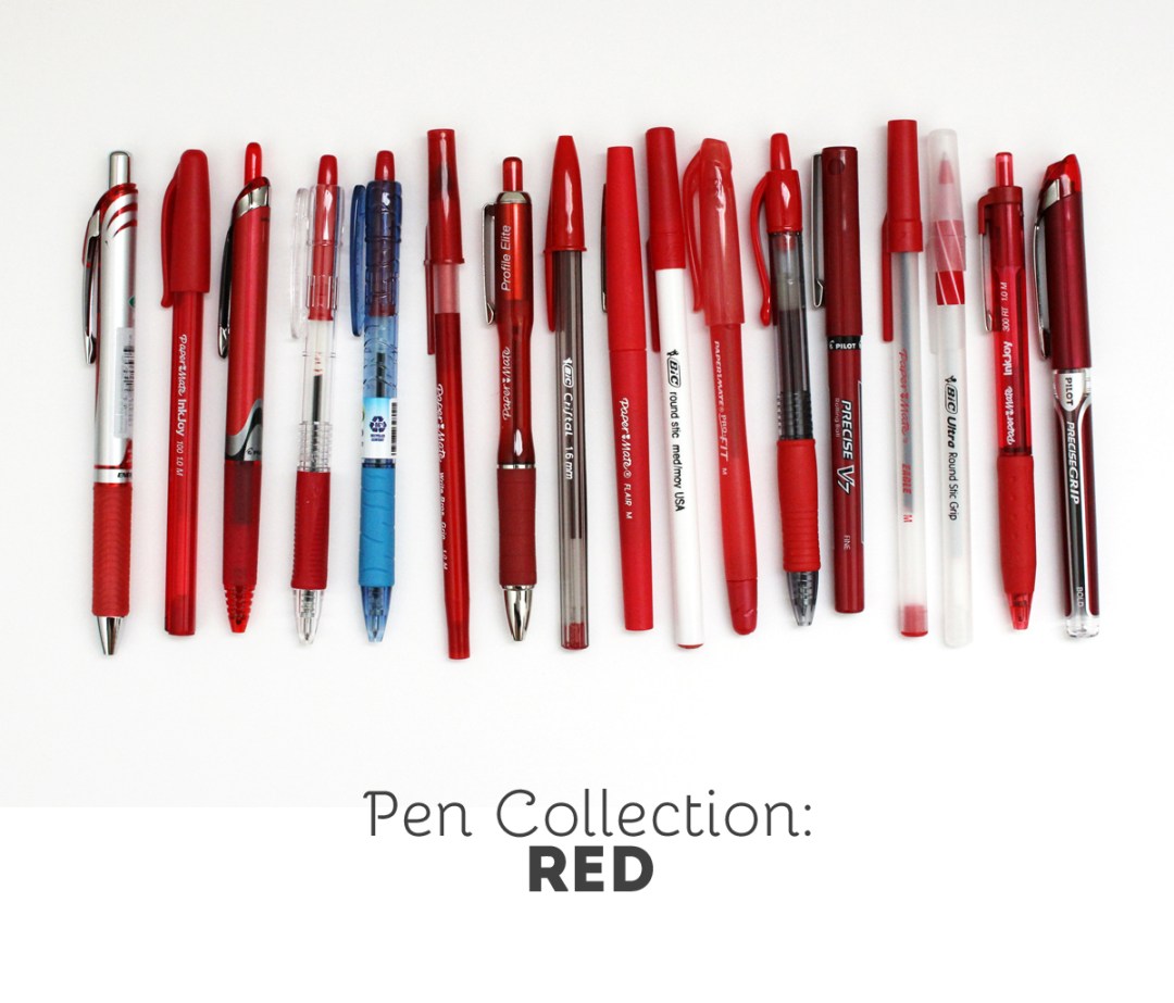
I have an obsession with office supplies and I’m a bit of a pen hoarder. One thing that I enjoy doing is swatching out my writing utensils to see how the colors compare between brands.
The Test: Each pen is used on white notebook paper and a yellow legal pad. You can click on the image below for a larger view.


The Pens: (links are affiliate) Paper Mate InkJoy 100 | Paper Mate InkJoy 300 RT
| Paper Mate Write Bros
| Paper Mate Write Bros Grip
| Papermate Eagle
| Papermate ProFit | Paper Mate Profile Elite
| Bic Round Stic | BIC Round Stic Grip
| BIC Cristal Bold
| Pilot EasyTouch
| Pilot B2P Bottle to Pen – Ball Point
| Pentel EnerGel
| Pilot G2 1.0
| Pilot Precise V7
| Pilot Precise V7 RT
| Pilot Precise Grip Bold
| Paper Mate Flair
The Conclusion: Red is one of the three basic colors, so tons of varieties are available. I don’t often write things out with red… it’s my go to color for crossing things off my lists.
Brush Lettering Process + Freebie

Ever wonder how letterers compose their designs? Some lettering artists appear to have a knack for composing their words and letters right on the page. My process is totally not like that. If I knew that I was trying to compose a lettering piece right there on that page, I’d clam up and probably never get started.
I’m going to share a special sneak into my process.
Jot down the phrase I want to letter

Get warmed up
Most times I will start with a simple alphabet to get the brush arm going. I use scrap paper for this so I don’t get hung up on wasting supplies.


One word per page
I letter each word separately and multiple times. Some could argue that it’s the art equivalent of “spray-and-pray” but it keeps me from locking up from perfectionism. When I know that I have another chance to write out a word, I end up performing a lot better. It’s all part of knowing myself!


Let my papers dry
Luckily I have a spare bedroom where I can spread out the papers on the floor and they won’t be disturbed.

Scanning
I use a ScanSnap iX500to scan as 600dpi in grayscale. This is the highest possible resolution of my scanner so that print quality will ultimately be fabulous. After scanning, the painted originals go in the recycling.


Turning each word into transparent PNG files
This part is quite lengthly, and consists of the following steps:
Select the best version of each word and crop it away from the rejects.

Adjust the blackness of the text using levels.

Create transparency around and within the lettering.

Clean up any digital noise that came in through the scan.

Adjust any wobbly edges in the letters.

Save the file as a PNG.
Putting the words together
I start by opening an 8×10 file since I’m aiming for that to be my final print size. I bring in all my PNG files and resize to fit.
Here’s where I’ll rearrange and decide where I want my words to be.

Options:

I use guides to help me stay centered and when I like my design, I’ll merge all my word layers.

Adding color
If I liked the black text, I could leave it there, but I love color! I add a new solid color layer using the layers menu and check the option for a clipping mask.

Saving as a JPEG
And that’s how I get to my final piece!
The process I use has a lot of steps to it, but I find it useful for being able to easily manipulate the composition of a lettering piece. It can give me a lot of flexibility for creating multiple orientations of the same sets of words.
And for sticking around til the end, you can download this print for free! Just pop your email address in the box below, and the download link will appear afterwards.
If you liked this post, please share with your friends!
Pinboard: Digital Graphics
I’m always keeping an eye out for graphics that I can use for all my digital art projects. I can incorporate graphics into the digital prints that I sell, into my art journals, or my project life pages. I collect the graphics that appeal to me on my Pinterest page (where else?) so I can scroll through easily when I want to stock up on more supplies. Take a look around and see if any of them appeal to you too!
Follow Olivia (Random Olive)’s board design: lovely graphics on Pinterest.
Pen Collection: Green

I have an obsession with office supplies and I’m a bit of a pen hoarder. One thing that I enjoy doing is swatching out my writing utensils to see how the colors compare between brands.
The Test: Each pen is used on white notebook paper and a yellow legal pad. You can click on the image below for a larger view.

The Pens: (links are affiliate) Paper Mate InkJoy 100 | Paper Mate InkJoy 300 RT
| Paper Mate Profile Elite
| Pilot B2P Bottle to Pen – Ball Point
| BIC Cristal Bold
| Pentel EnerGel
| Pilot G2
| Pilot G2 1.0
| Pilot Precise V7 RT
| Paper Mate Flair
The Conclusion: Green is another fun color I love to write with when I’m at work. The Papermate Inkjoys are very pale, so I don’t enjoy those as much. The Papermate Profile and Bic Cristal Bold provide lovely dark green shades though. And any of the gel, rollerball, or felt tips are solid.
Pinboard: Wall Art I Want to Buy
So I kind of have this love of bright and colorful wall art. It may be due to the two gallery walls I have in my house (one downstairs and one upstairs). I just love the idea of hanging all this good stuff in prominent places that I can see. Too bad I don’t have enough wall space for everything!
Check out all the wall art I’ve been pinning on Pinterest and follow this board for updates on other art I’d love to buy.
Follow Olivia (Random Olive)’s board walls: art i want to buy on Pinterest.
Skillshare Course Review: The First Steps of Hand-Lettering

I’ve talked before about some of the classes I’ve taken on Skillshare. Here’s another one for you: The First Steps of Hand-Lettering by Mary Kate McDevitt. I love taking these types of classes because I enjoy watching the process that lettering artists use so that I can adapt some of the processes into my own lettering and art.
My main takeaways:
Brainstorming for Style:
The main project from this course is to letter out a short phrase or quote. Mary Kate describes her brainstorming process for developing a style that suits the phrase or quote that you plan on using. She shares how to approach the sentiment behind the phrase and the visual influences you could use.
Lettering Tools and Paper:
Mary Kate goes over which tools she prefers to use for each stage of the process as she’s sketching. While it can be helpful to see the tools the pros use, they tend to emphasize that the best tool is the one you have. And many letterers have different preferences.
Lettering Styles:
The most useful part for me was to see different lettering styles and how they’re drawn. There are examples of various styles (script, serif, sans serif, and more) as well as a live demo and step-by-step tips on drawing some of them (block letters, script, flourishes, and serif).
Overall Impressions:
This was one of the first online classes I had taken about lettering. Many of the skills that Mary Kate goes over are useful and applicable to whatever style of lettering that you want to produce. It was nice to see all the steps laid out in a methodical order. For anyone interested in learning to handletter and wants a comprehensive introduction, this is a great resource.
The links provided for this Skillshare course are referral links. If you sign up for a Skillshare membership using these links, I will receive a free month of membership. This will allow me to view and review even more courses on the blog.
Pen Collection: Blue

I have an obsession with office supplies and I’m a bit of a pen hoarder. One thing that I enjoy doing is swatching out my writing utensils to see how the colors compare between brands.
The Test: Each pen is used on white notebook paper and a yellow legal pad. You can click on the image below for a larger view.


The Pens: (links are affiliate) Paper Mate InkJoy 100 | Paper Mate InkJoy 300 RT
| Paper Mate Comfortmate
| Papermate ProFit | Paper Mate Profile Elite
| BIC Ultra Round Stic Grip
| BIC Velocity
| BIC Cristal Bold
| Pilot EasyTouch
| Pilot Acroball | Pilot B2P Bottle to Pen – Ball Point
| Zebra Sarasa
| Pentel EnerGel
| Pilot G2 1.0
| Zebra NR7 | Pilot Precise V7
| Pilot Precise V7 RT
| Pilot Precise Grip Bold
| Paper Mate Flair
The Conclusion: Blue is one of the three basic colors, so tons of varieties are available. I like using blue ink on forms to differentiate from the black that’s already printed there. Of note, the Zebra Sarasa is more of a blue-black color compared to the rest.
Pen Collection: Light Blue

I have an obsession with office supplies and I’m a bit of a pen hoarder. One thing that I enjoy doing is swatching out my writing utensils to see how the colors compare between brands.
The Test: Each pen is used on white notebook paper and a yellow legal pad. You can click on the image below for a larger view.

The Pens: (links are affiliate) Paper Mate InkJoy 100 | Paper Mate InkJoy 300 RT
| Paper Mate Profile Elite
| Pilot Acroball | BIC Round Stic Grip
| BIC Cristal Bold
| Zebra NR7 | Paper Mate Flair
The Conclusion: Light blues are another fun color to get away from the basics. The worst performers of my collection were the Pilot Acroball and Bic Round Stic Grip – way too pale for my liking.

